Project Brief
ChefBörek wanted to gain brand awareness in the target audience in order to increase its digital and physical sales. It also needed a new architectural concept.
Client
ChefBörek
Brief
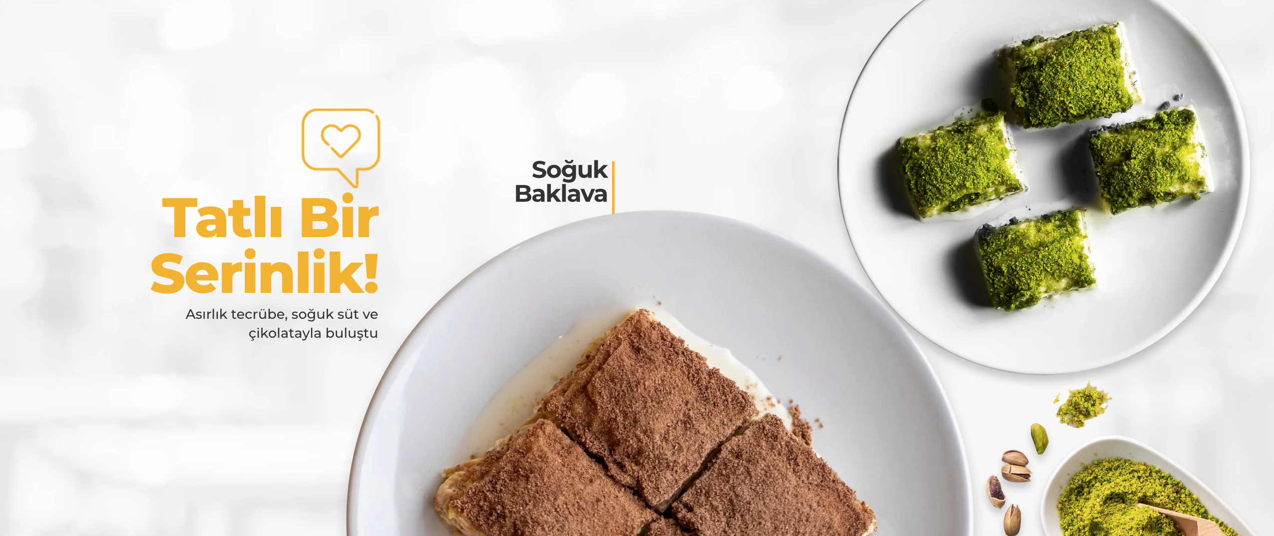
We were expected to facilitate emotional affiliation with audience, to promote brand recognition with a new identity, renovate interior designs in the spirit of this new identity.

Approach
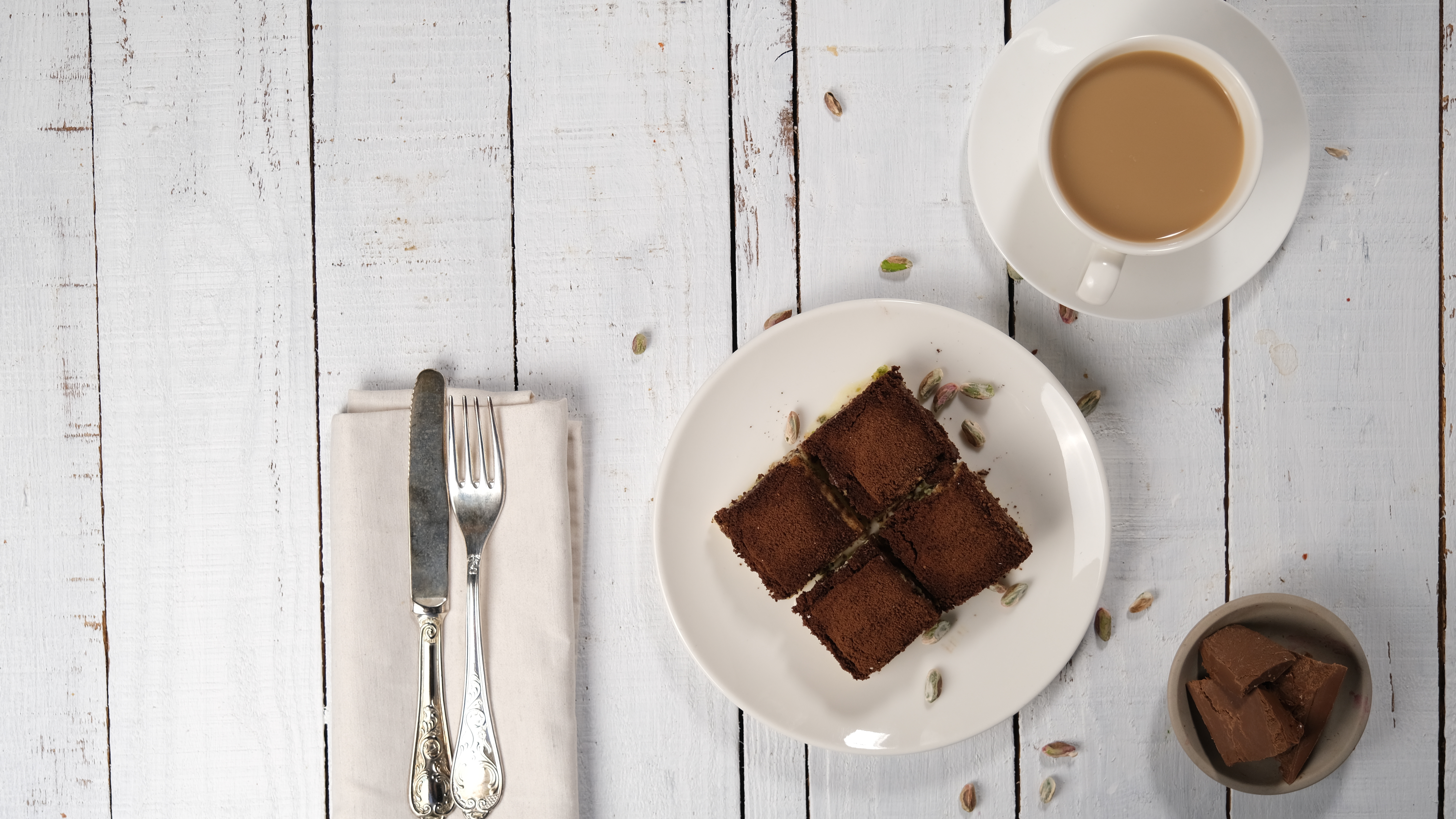
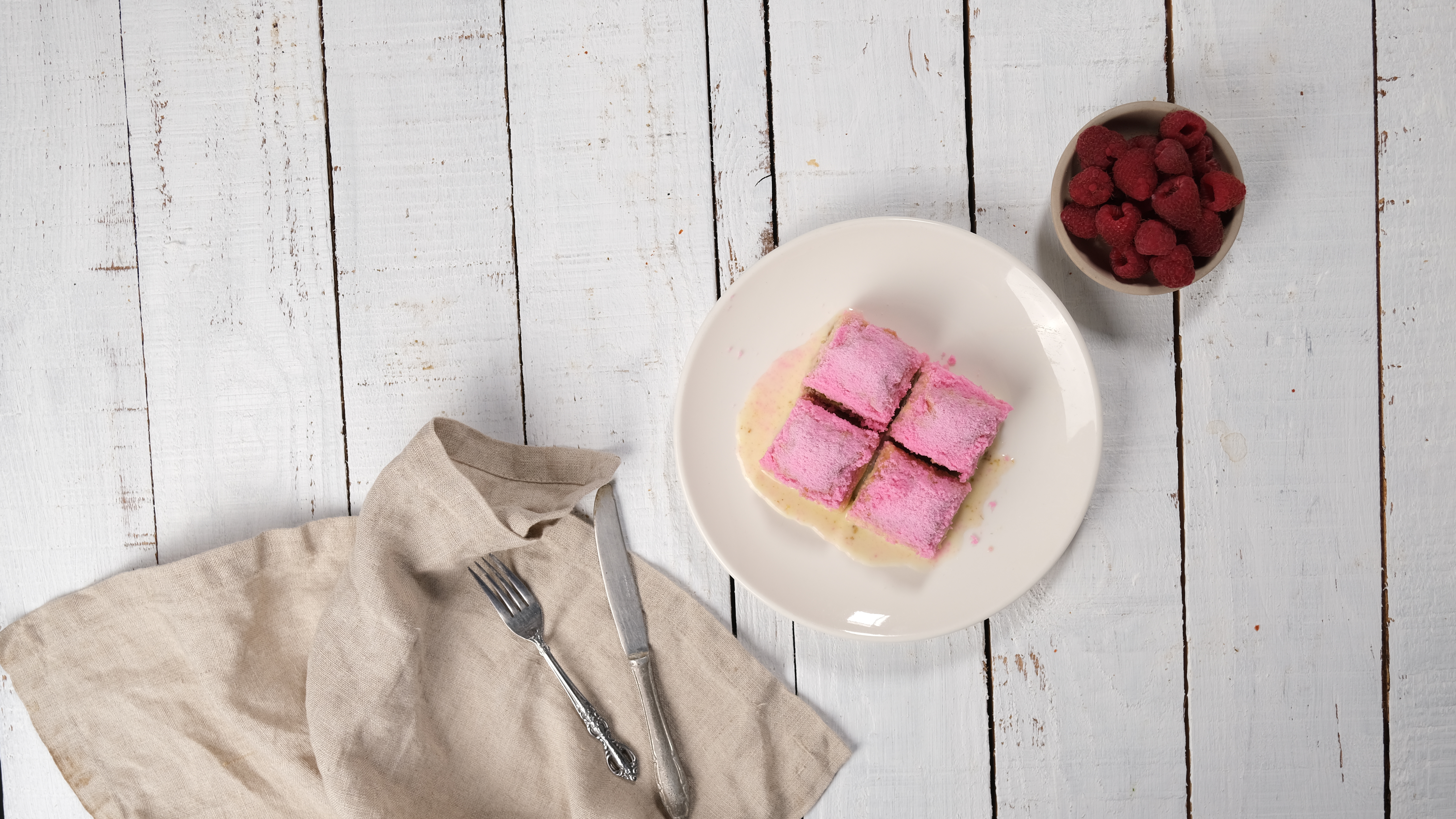
First, we brought together with our advertising professionals, master architect as well as skilled software specialists. We defined the corporate identity with interdisciplinary contributions of our team for our ChefBörek brand for whom we also devised a marketing and advertising strategy. We implemented a 360° marketing process from product portfolio to spaces, digital advertising to software and workflow processes of our brand who adopted Pastry Restaurant & Cafe concept for the first time in Turkey.
Advertising
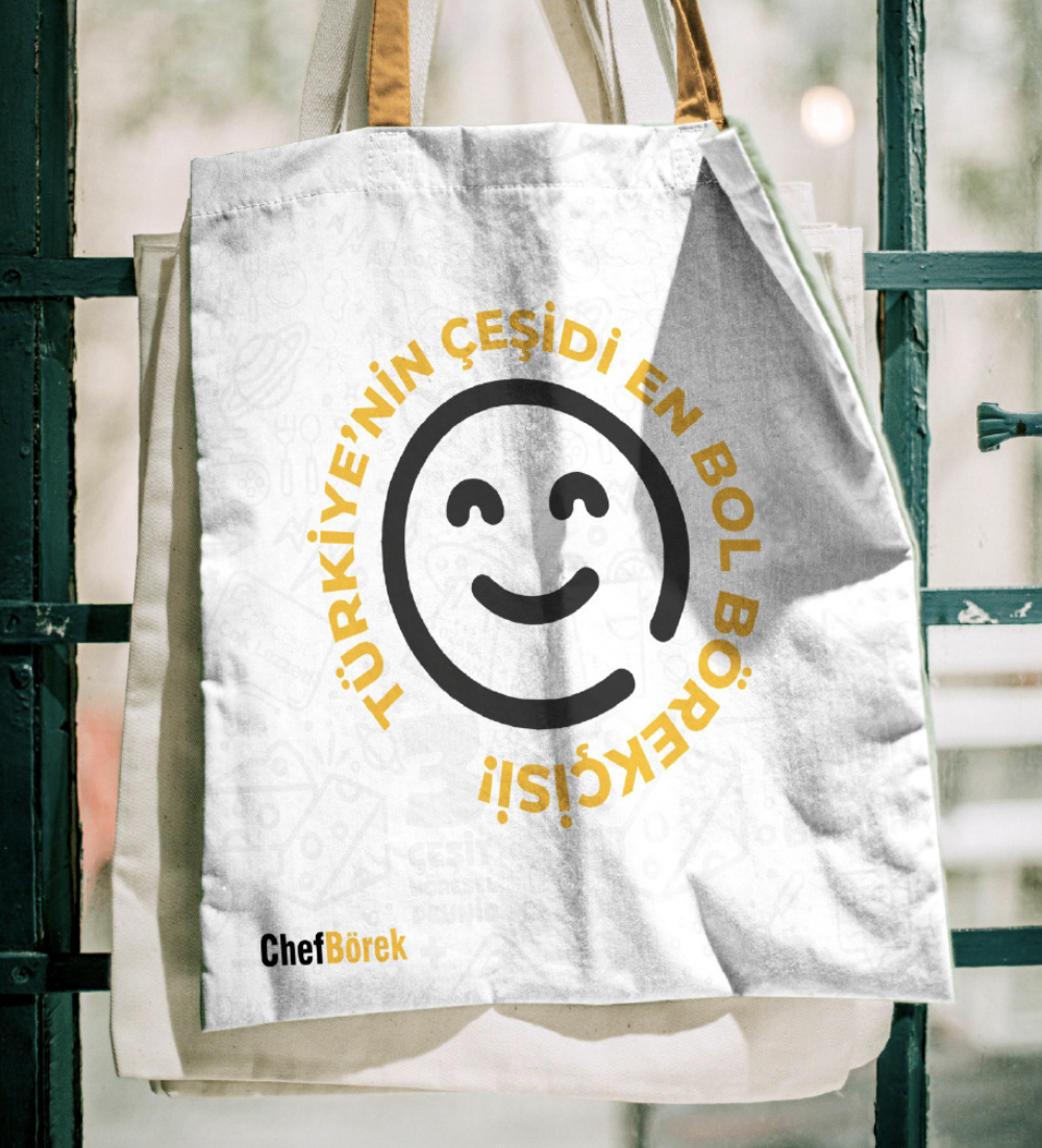
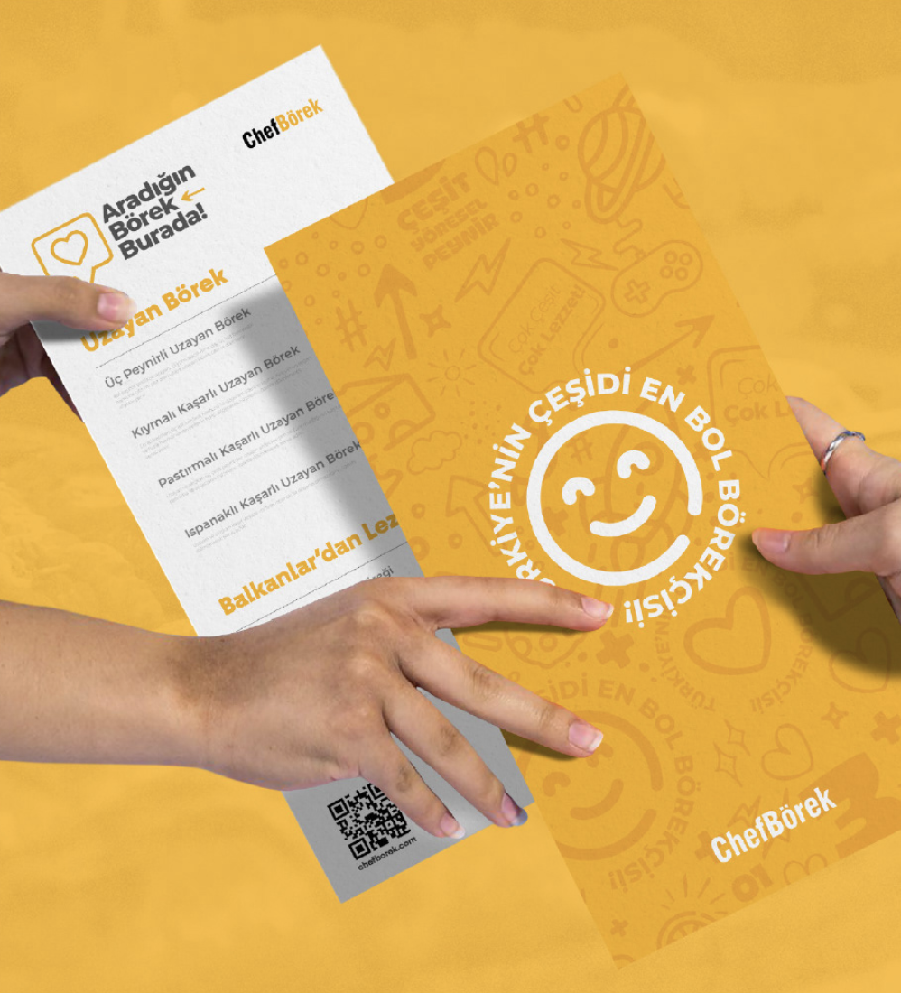
We assessed the current outlook of ChefBörek with market, competitor and situation analyses. Then, we reached the insights on our audience, especially food-lovers, pastry-lovers, in particular, with audience analysis. In line with these insights, we defined our creative motto, and built all our communication plans on this motto, and then set things in motion. We chose yellow and black colors in entire corporate identity, starting from logo. And we made an indelible impression on our brand in collaboration with many celebrities and influencers in the digital media. Besides brand recognition, we collected many demands via our social media franchise ads. With the materials we provided to our brand (franchise presentation, franchise page, etc.) during franchise meetings, we facilitated the decision-making process of prospective franchisees. In line with demands, we created a huge ChefBörek family, boosting the number of franchisee, reaching to many corners of Turkey.



Architecture
We built a clear-cut and catchy ambience for both personnel and guests by offering comfort and function together. We generated a harmony between entire corporate identity and cafe interior design, starting by logo. We mobilized even color, material and textures of the interior spaces, collectively to reinforce catchiness and delicious perceptions towards brand. "We built a transparent, cozy, clear-cut, contemporary space where guests and employees easily interact with each other, instead of a cafes having furniture, high separations and large gaps creating a harsh disconnect between personnel, waiters and guests.

